Before and After: Real Font-Matching Examples
When you need to edit text in an image with the same font, the words are only half the job. The replacement also needs to belong in the design. We made these source images with known fonts and submitted them through this editor’s real AI service. The outputs use the editor’s selection and composition code, without manual retouching.
A sans-serif heading in a screenshot
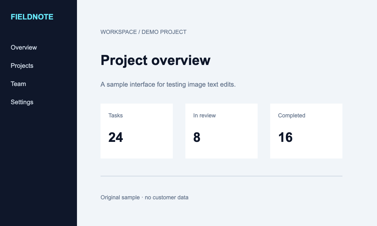
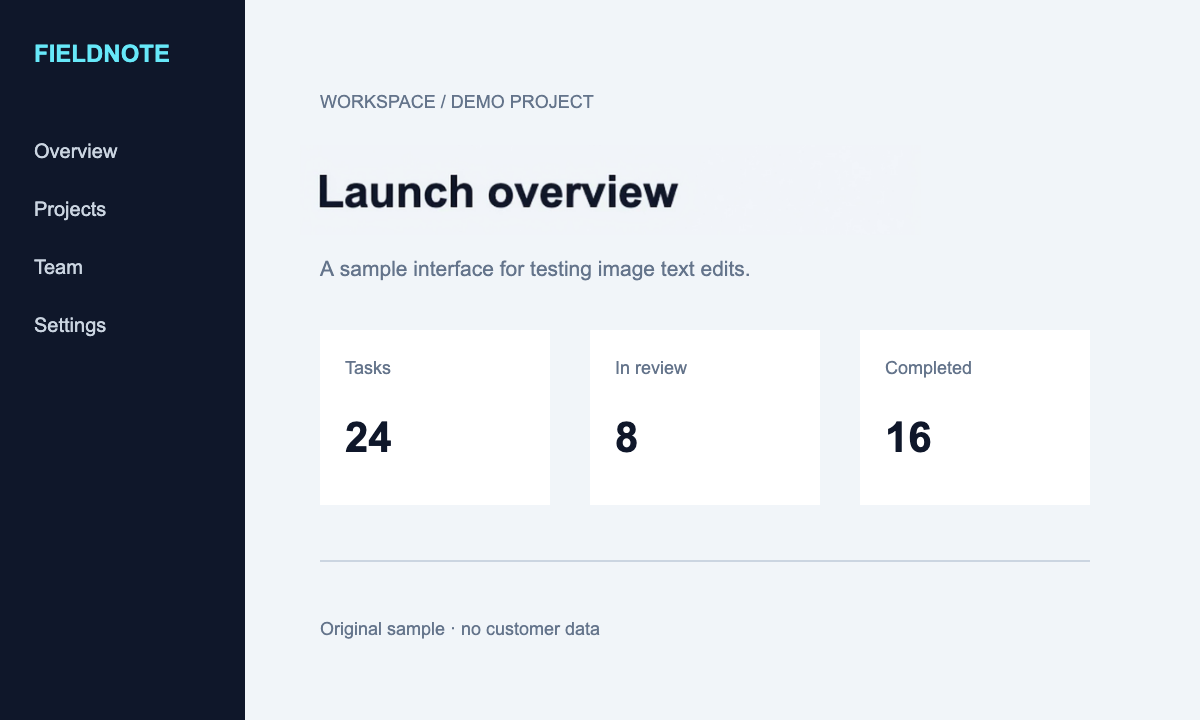
A serif title in a JPG poster
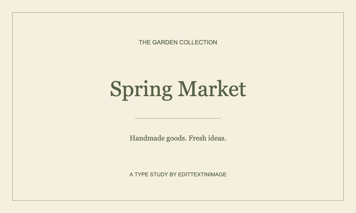
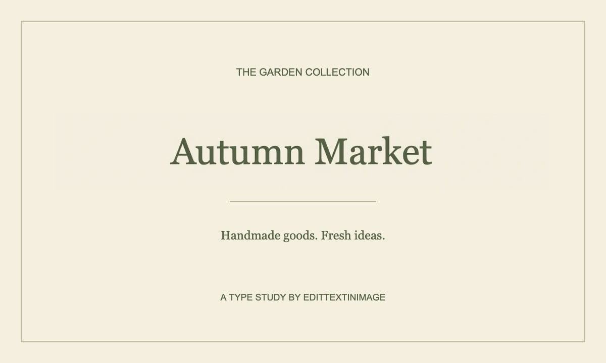
A longer replacement with a shadow: a visible tradeoff
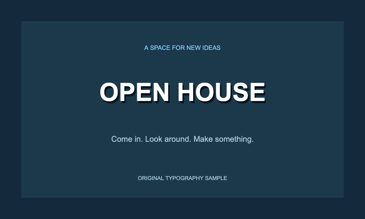
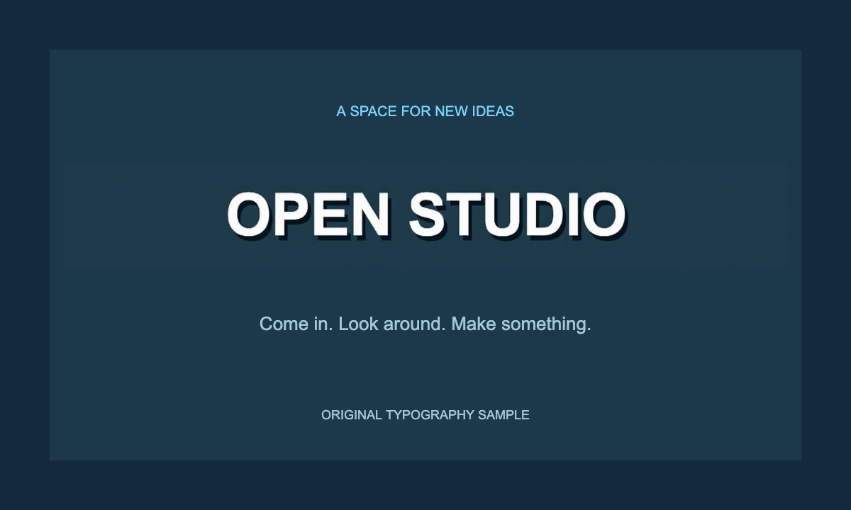
These are three individual results, not an accuracy benchmark. The first two retain a useful visual resemblance; the shadow example also exposes a background change. Compare letter height, baseline, stroke weight, and the area around the words. Correct spelling alone does not make an edit ready to publish.
How to Edit Text While Keeping the Same Font
- Upload the clearest original. Choose an opaque JPG, PNG, or WebP, up to 10 MiB. The image must also fit within 6,000 pixels on either edge and 12 megapixels. A direct export usually contains more useful letter detail than a screenshot of a screenshot.
- Select one complete phrase. Drag a rectangle around all the letters, including dots, accents, outlines, and shadows. Leave a little clear background inside the box. Keep unrelated labels, icons, and other lines outside the selection.
- Enter the original and replacement text. Copy the visible wording accurately, including capitalization and punctuation. Keep the new phrase close to the old phrase’s length. The fields accept one line each; they do not rearrange an entire paragraph.
- Generate and compare. Select Replace text, keep the tab open, and then switch between the original and edited preview. Read every character before judging the font. Correct spelling is essential even when the overall style looks convincing.
- Download and inspect. Save the PNG and view it at its original size. Check the text again at the size your audience will actually see. If the match is poor, return to the original, adjust the selection or wording, and consider another method.
You can complete this workflow on this page without creating an account. Free use is limited by daily allowances and available capacity. A new generation is a new attempt, so reviewing the selection first is more useful than repeatedly submitting an unchanged request.
What Can the Original Font Match Include?
Letter shapes and weight
The editor uses the visible lettering as a visual reference. It tries to carry over serif or sans-serif shapes, stroke thickness, and proportions. It does not recover a font file or tell you its exact family name. Individual letterforms can still differ.
Size, baseline, and spacing
A good replacement follows the original text height and line position. The available rectangle also matters: wider wording can force smaller letters or tighter spacing. There are no manual font-size, tracking, or position sliders in this version.
Text color and effects
Color, contrast, and simple shadows may carry over with the edit. Outlines, metallic textures, and layered effects are harder because the model has to reconstruct the effect around new letter shapes. Inspect light and dark edges separately.
The surrounding background
Only the selected rectangle is placed back into the full image. Pixels outside it stay in the original browser image. Within that rectangle, the background is generated too, so texture, gradients, or decoration behind the letters may change.
“Same font” here means an attempt to match the original appearance. If a brand guide requires an exact licensed typeface, use the source design and that font. Our Photoshop text guide explains the difference between editing a live type layer and rebuilding text that has been flattened into pixels.
Tips for a Closer Font Match
Keep the replacement within the same visual width
Character count is only a starting point. “WWW” is wider than “ill” in many fonts, even though both contain three letters. Compare the likely width of your new wording with the old line. Shortening a heading can preserve its visual balance better than asking the model to squeeze a long sentence into a small label.
Give the selection room without including a second task
A box that touches the strokes can cut off descenders or shadows. A box that covers half the image gives the edit too much unrelated detail. Aim for one complete text line and a modest margin around it. For dense interfaces, the screenshot text editor explains how to isolate a label without including neighboring controls.
Compare recognizable letters, not just the overall impression
Look at repeated letters, round shapes, and narrow strokes. Check whether capital letters have the same height, whether the baseline is level, and whether spaces look natural. Toggle the previews, then open the download at full size. A small preview can hide doubled edges or an incorrect character that becomes obvious in the final asset.
Limitations and Difficult Font-Matching Cases
Clear, horizontal print is the best starting point. Blurry images, tiny interface text, handwriting, curved lettering, and strongly distorted perspective contain less reliable information for a font match. Decorative banners also combine text and illustration in a way that makes background preservation difficult.
In an earlier tight button-label test, changing “START FREE TRIAL” to “VIEW PRICING” did not preserve every requested character. Treat a successful heading example separately from small UI labels. Shorten the replacement, use a larger original, or edit the source interface and capture it again if precise lettering is essential.
The editor can reject an output when the border of the selected area changes too much, but that check cannot verify spelling or prove that every background detail is intact. Chinese editing is experimental. Review each character yourself, and keep the original file so you can return to it. For compression-related problems, see the JPG text editor and image-quality tips.
Questions About Editing Text with the Same Font
Can I edit the text without knowing the font name?
Yes. The model works from the visible image, so you do not have to identify or upload a font. A clear source and a well-chosen selection help it interpret the lettering. If you already have the editable source file, changing its text layer is usually more predictable.
Will the result use the exact same font?
Exact font reproduction is not guaranteed. The result is generated pixels that aim to match the original style, not text rendered from a recovered font file. Compare distinctive letter shapes before using the image in a design with strict typography requirements.
What if my replacement text is longer?
It may become smaller, more tightly spaced, or incorrectly rendered inside the available area. Try a shorter phrase first. If the full wording is necessary, rebuild the layout in the original design tool instead of relying on a fixed selection to create extra space.
Can I manually adjust font size, color, or spacing?
Not in this version. You control the source image, original wording, replacement wording, and selection. For precise manual typography controls, follow the Photoshop or Canva guide and keep an editable text layer in your project.
Why does the edited text look different?
The image may be too small, the replacement may not fit, or the original style may be unusually complex. Check spelling first, then letter height, weight, spacing, and the selection edges. A visually similar font can still have different individual glyphs.
Is the entire image uploaded, and what can I download?
The original stays in your browser. A crop containing the selected area and some surrounding context is sent to the AI provider. The browser puts only the selected rectangle back into the original and exports a full-size PNG. Read the privacy details before uploading sensitive content.
Try a closer match to the original font
Start with a clear phrase, then compare its letter shapes, spacing, and background.
Try the same-font editor